

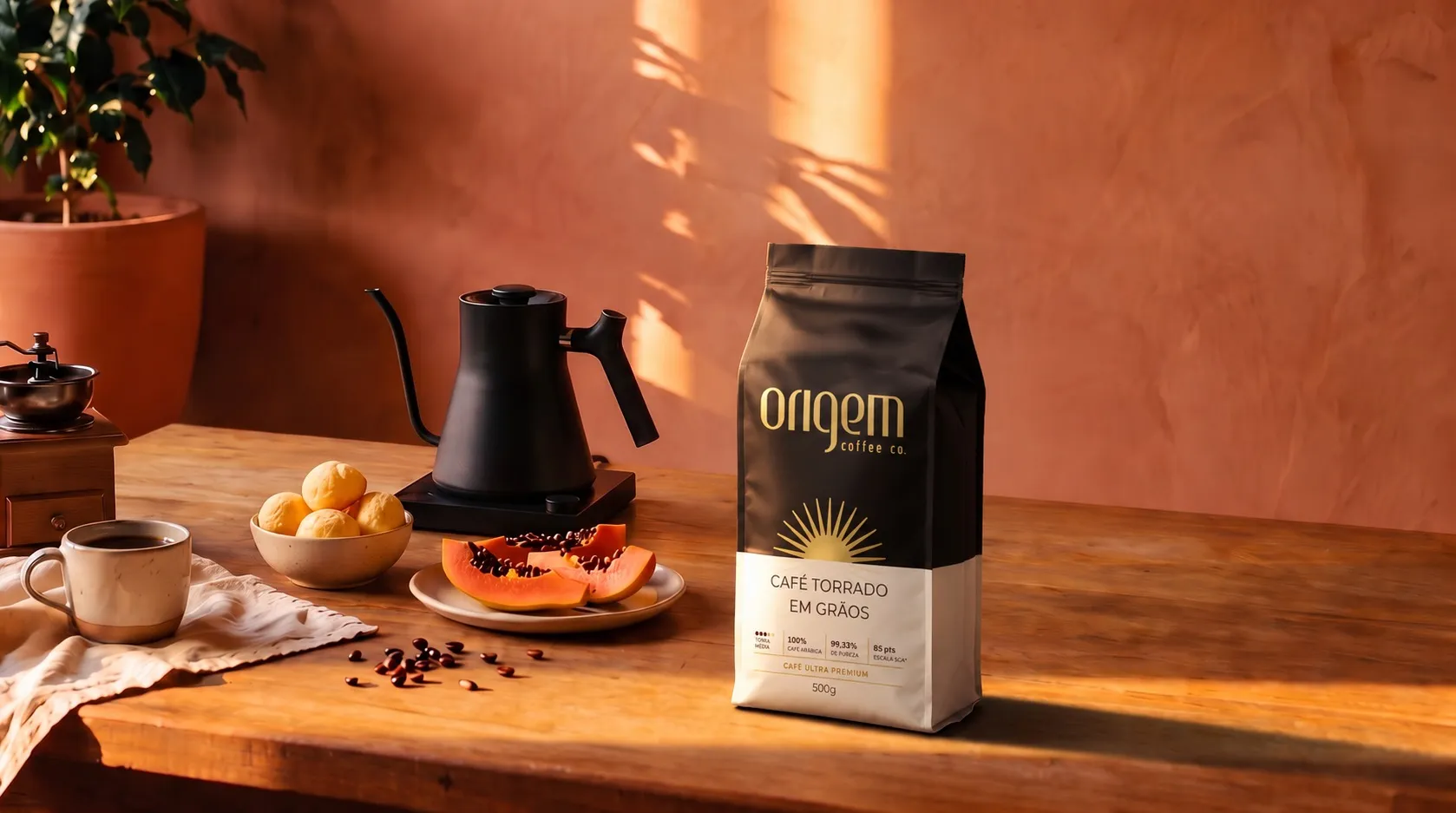
Origem Coffee Co. · Packaging
Eleven years of a partnership that became a brand.
A brand doesn't just change its packaging. It changes its standing.


01
A brand born with Jazz.
Origem Coffee Co. started as a Porto Alegre coffee shop devoted to tasting specialty coffee. The product already stood apart. The brand didn't say so yet.
The challenge Jazz took on was to make the brand reflect the distinction the coffee already had, give it a personality and bring its communication up to a professional standard. The project began with 360º research and went on to a new positioning, naming, logo, visual identity and the very first labels.
Eleven years later, the Iguatemi Porto Alegre store is still the brand's anchor, and Origem has become a manufacturer. It sells retail and wholesale, B2B and B2C, supplying the country's leading supermarket chains, convenience stores and delis.
“Jazz is the company that built our brand, not just the logo but the name too. We are Origem Coffee today because of Jazz.”
02
From brand to product.
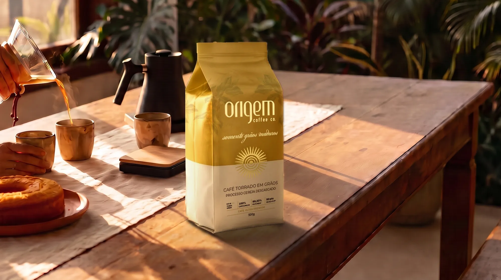
When a coffee shop becomes a manufacturer, the package takes over the job the store used to do. It has to stand out on supermarket shelves, catch the eye of whoever walks by and stay in the spotlight on the kitchen table.
“The quality of the coffee is the easy part. Anyone can buy good coffee from a good farm and sell it. The hard part is everything else.”
That is why Origem's briefs were never about looks. Every package starts from the product itself: the type of coffee, its score, the region, the grower, the process and the place that coffee needs to hold on the shelf. In eleven years, not a single brief has used another coffee package as a reference.
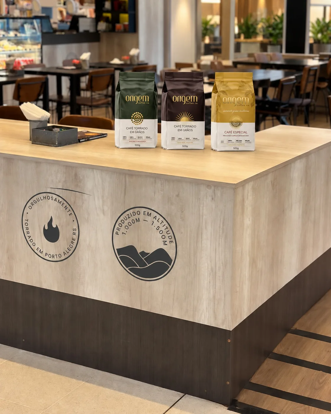
03
A system built in layers.
Launch after launch, Jazz built Origem a packaging system organized in layers. Each product gets a personality of its own, yet all of them share the same symbolic and structural roots.
Structure
Signature, a two part body, technical attributes in plain sight and the same statement of provenance on the back: from our roastery to your home.
Symbol
The sun: the origin of life, a source of energy, nature's first nourishment. The thread that runs through the whole portfolio.
Personality
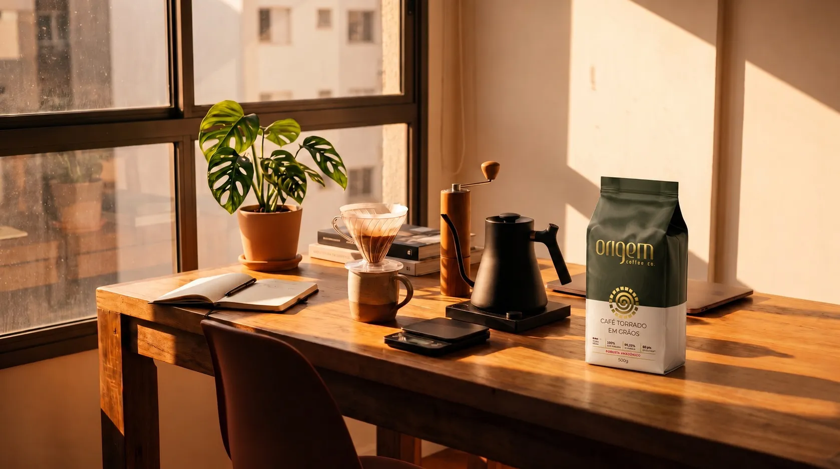
Each sun grows out of research into that particular coffee and points to where it was planted and harvested. The sun changes shape. The system stays.
04
A sun for every origin.
Nobody needs to know the research to feel its effect. But whoever asks will find an answer.
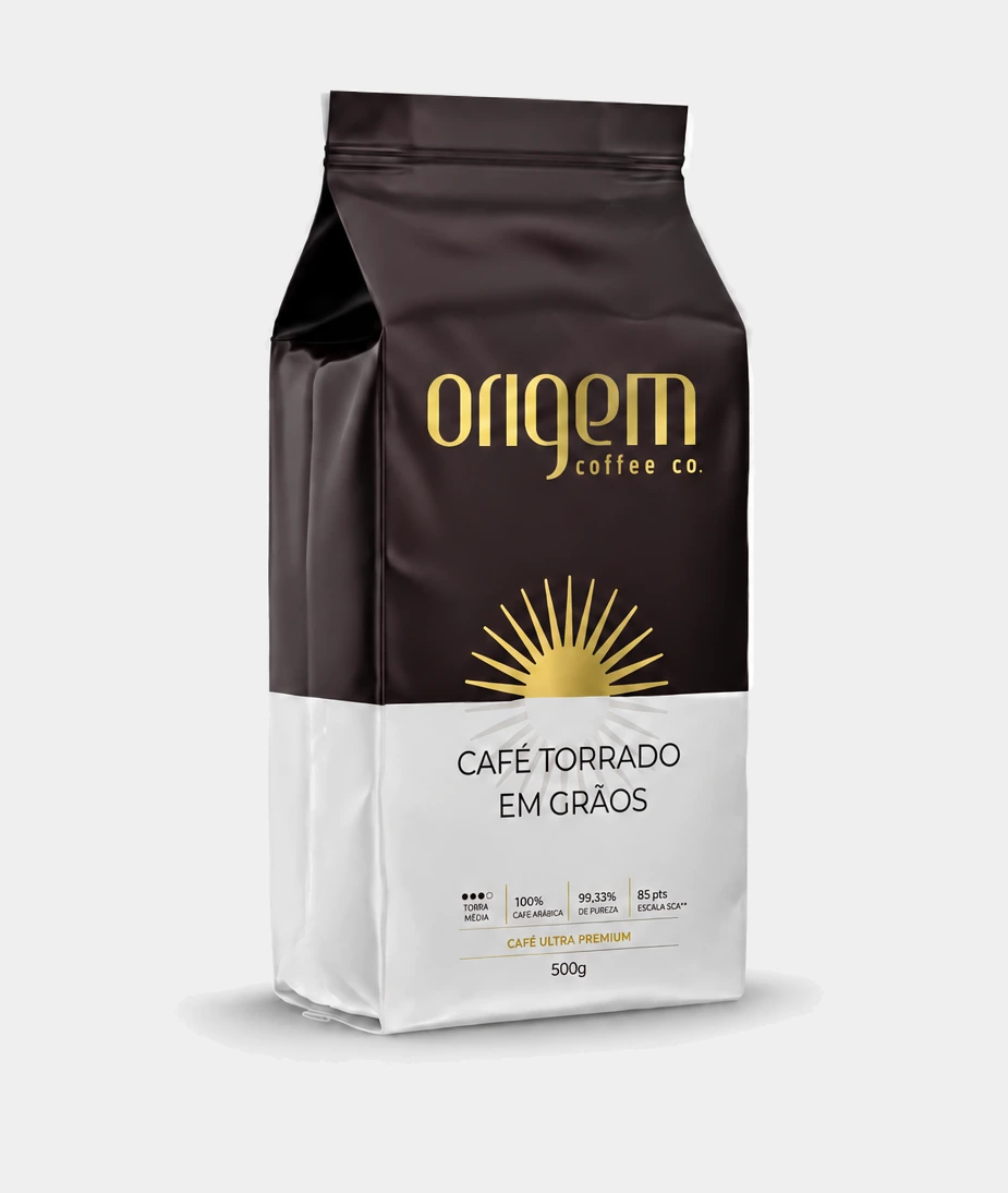
Whole Bean Coffee
The solar sun.
The package that started the system. Dark brown and gold, an ultra premium arabica. Its sun comes straight from the brand concept: origin as the starting point, and the sun as the star at the center of a system, the source of all energy.
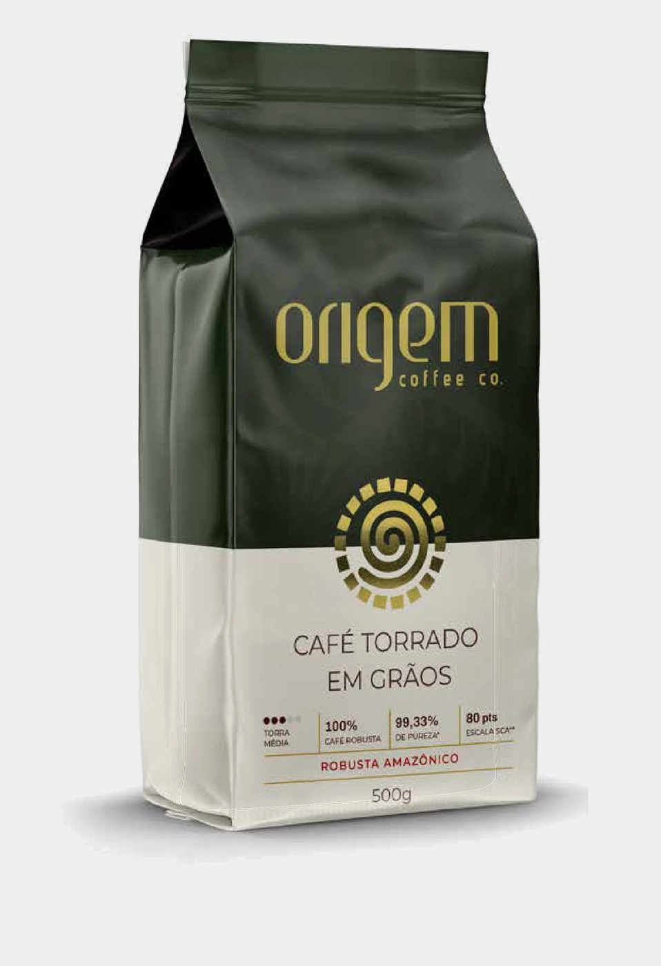
Amazonian Robusta
The African sun.
The research traveled through ancestral sun symbols from many cultures and arrived at Owia Kokroko, an Adinkra symbol from Ghana that stands for the greatness of the sun, vitality and renewal. Then came the discovery: the genetics of the Amazonian robusta plant trace back to Africa.
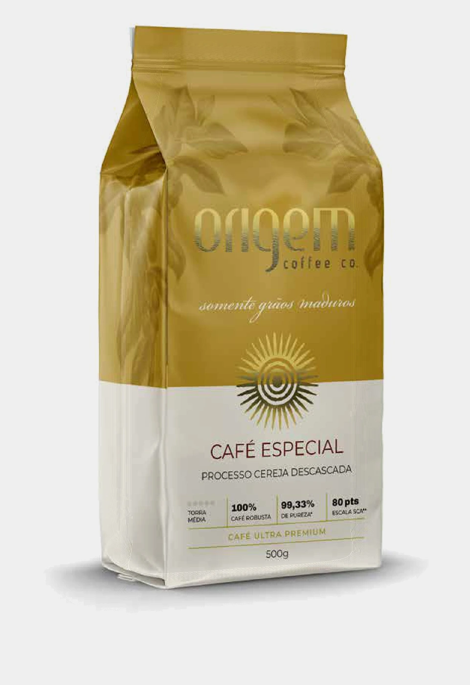
Pulped Natural Specialty Coffee
The cordel sun.
A coffee from Espírito Santo, processed as pulped natural, where only ripe cherries make the cut. Its sun comes from the woodcuts of cordel literature, with their rays and concentric circles, and from the visual identity of Espírito Santo, layered from Indigenous, African, Portuguese, Italian and Pomeranian cultures.
05
A package that sells twice.
A manufacturer selling B2B and B2C has two very different audiences to win over. Origem's packaging works for both.
For the people who drink it
1:2
For every kilo of coffee served at the Iguatemi store, customers take two kilos home in the packaging designed by Jazz.
For the buyers who stock it
+41%
Yearly growth in B2B sales of Origem bags since 2023. In 2026 alone, so far, +61%.
“People touch the package, or see us take it out of the bag, and it's like it lights up. It raised the bar.”
This is where the layered system shows its commercial value. Every new product reaches the retail buyer carrying the recognition earned by the ones before it.
“The first product was probably the hardest. The next ones keep getting easier: whoever liked the first is more inclined to buy the new one.”
06
Built to last, by design.
In coffee, as in many categories, some packaging is made for the season. It makes noise, sells fast and ages along with the trend. Origem chose the opposite path from the very first brief: a brand that is current and lasting.
“Designing a classic package is harder than designing a playful one, just as playing classical music is probably harder than playing funk.”
07
Product families.
The 500 g supermarket bag is one front. For other channels and occasions, Jazz also designed the everyday 250 g bag, the boxes for seasonal editions and the Subscription Club box, made for people who collect growers. Each line has its own format, material and color. The family name never changes.
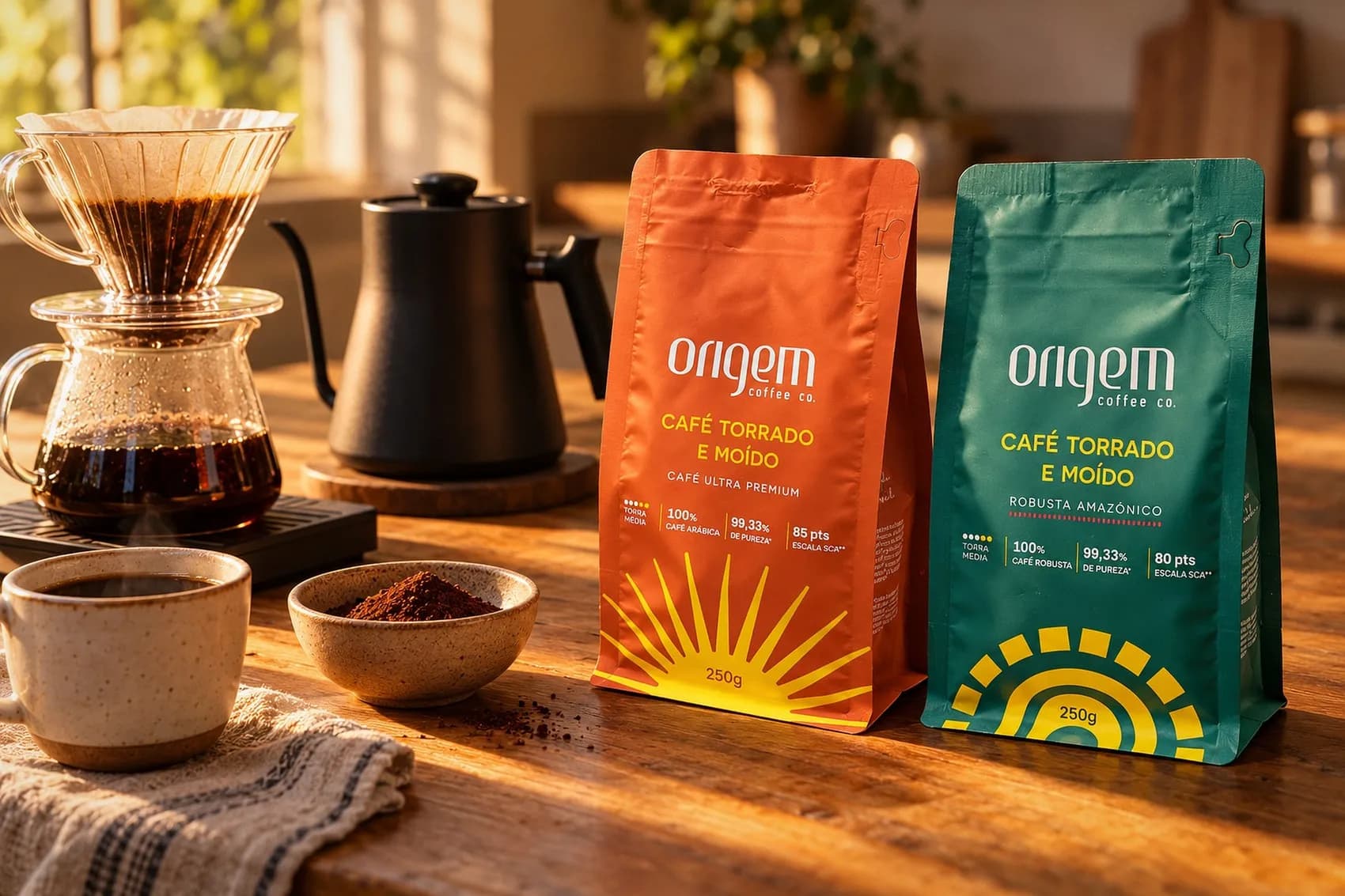
Ground Coffee · 250 g
The sun rises from the base.
This extension carries the sun system into a smaller format and into ground coffee, ready for the everyday brew. The Ultra Premium swaps dark brown for an intense orange; the Amazonian Robusta keeps its deep green. On both, the sun rises from the bottom of the bag. Same coffees, same scores, sized for a week's worth.
Seasonal Editions · 250 g
Made to look like a collector's edition.
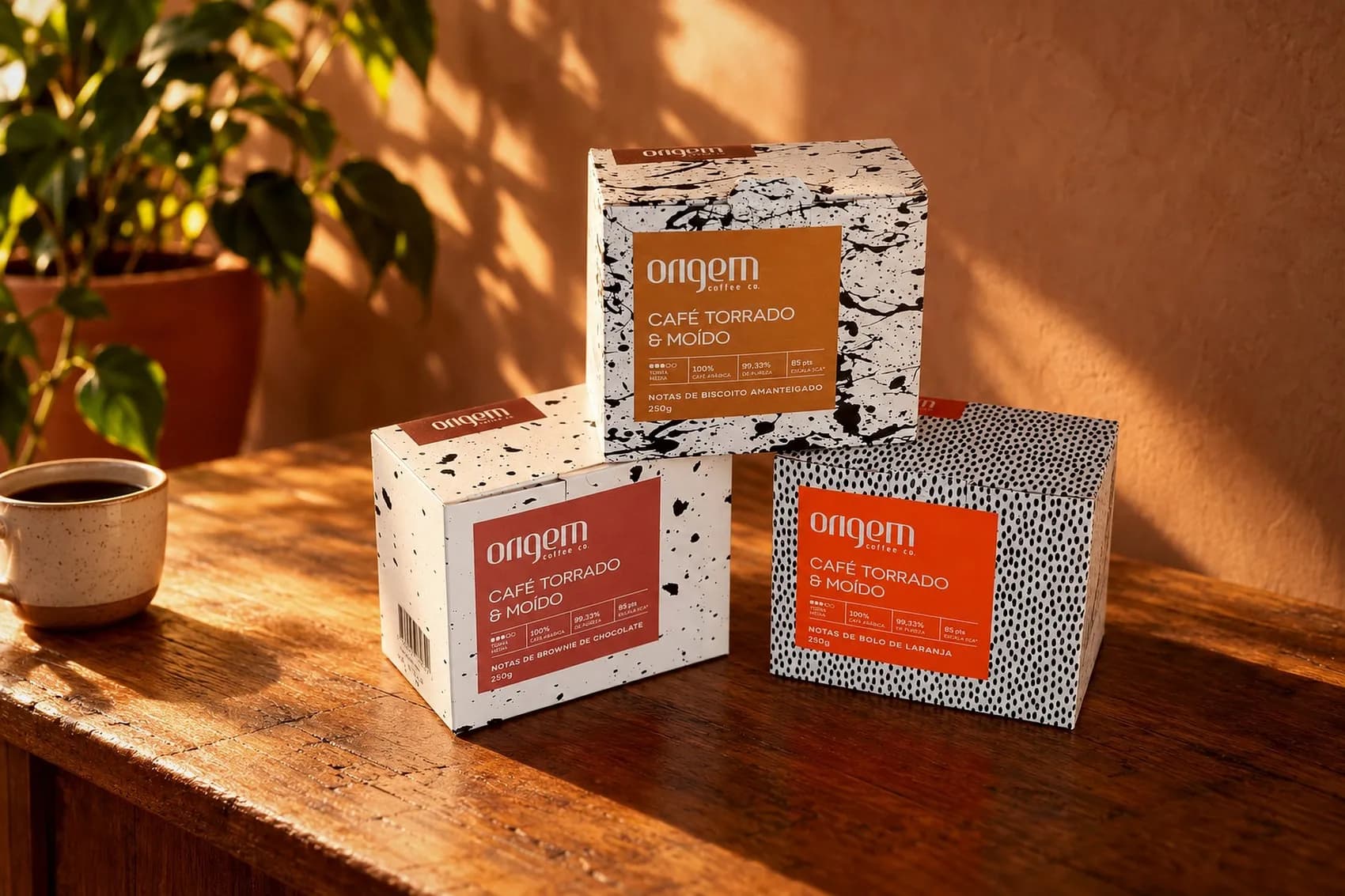
Boxes for short harvest coffees, dressed in black and white splatter and dot patterns that give every release the weight of a limited edition. The label color translates the tasting note: the caramel of butter cookies, the terracotta of chocolate brownie, the orange of orange cake.
Nanolots · Subscription Club
The name of the grower.
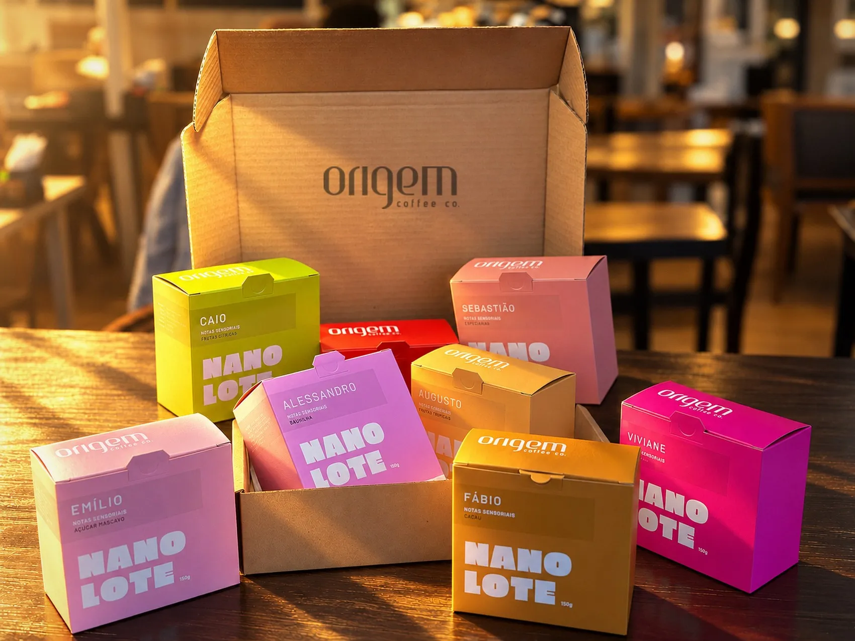
Origem's most exclusive coffee: tiny lots bought straight from hand picked growers and delivered through the Subscription Club. Each box carries the name of the person who grew the coffee and gets a color of its own, tied to its tasting notes. Poster sized type and flat color make every lot recognizable from across the room, before the box is even opened.
This isn't about coffee. It's about how Jazz thinks and builds products.
A brand created from the name to the identity. A packaging system where every sun tells where its coffee comes from. Two kilos taken home for every kilo served in the store.
If your brand needs design that sells on the shelf, wins over the retail buyer and goes through the years without aging, this is what we do.
Eleven years of proof.